The font (also termed as ‘typeface’) chosen for any sign can make or break the message - it can say a lot about the character of a business and what customers can expect. It can also ensure the message gets across efficiently. With over 500,000 fonts available to choose from, selecting the best choice to convey a message into print, poster or a sign design is key… so where to start?
Top Tip; psychology comes first
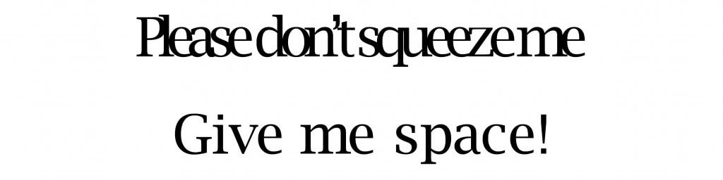
The simple choice between ‘upper case’ or ‘lower case’ text can bring a powerful advantage;
Lower Case is most effective for quick-read assimilation.
From birth the human mind develops to recognise the world first by shape; faces, pictures and later words. Lower case text is actually an arrangement of familiar shapes already well embedded from that early stage of life, lower case brings the advantage that any word can be seen and understood intuitively without the need to consciously read!
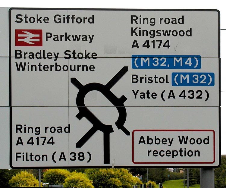
For this same reason lower case has become the preferred choice for all directional road signs.
Lower case is also most effective in poster advertising situations, particularly for drive-by sites ie forefronts & forecourts, roadside verges, escalator advertising, airports, shopping malls, corridors and similar footfall locations where quick recognition is all important.
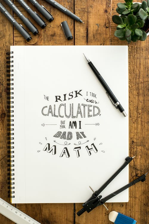
Lower case in action… on a day to day basis
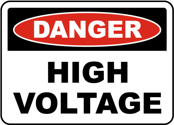
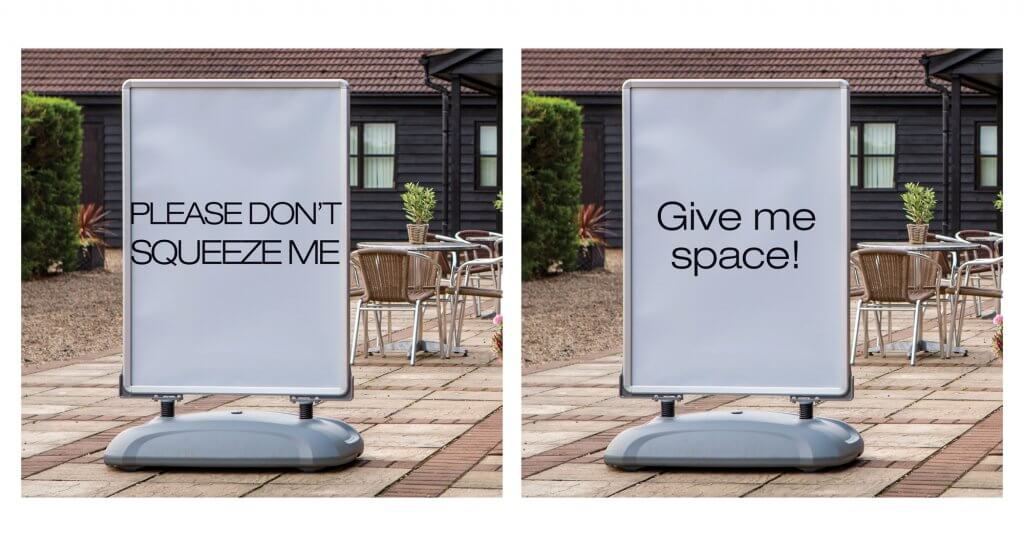
Upper Case fonts also have their place in signage; being particularly suited for warning signs and instructive signs. The upper case conveys a sense of authority, yet care should be taken as upper case text can also sometimes be misconstrued as “shouting!”
Warning Signs can use uppercase fonts for instructional effect:
Serif and sans serif
A serif is the little flick or elaboration onto a letter to create a distinct letter form. The ‘serif tails’ can help the reader to ‘flow’ onto the next word to be read.
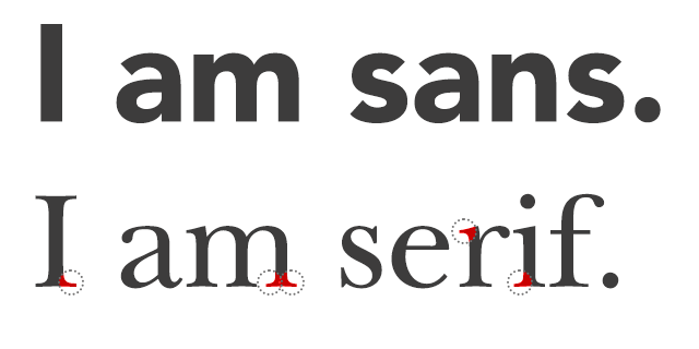
Serif fonts have been around for much longer in typography than their cleaner, cooler sans serif counterparts. They are considered to be a little old fashioned by some, but certainly have an established, quietly confident air about them. Over the past 30 years , ‘sans serif’ (French for “without serifs”) fonts have been most frequently used, primarily because of their readability, but with advances in screen clarity and technology, serif fonts will slowly but surely now making their way back into the limelight.
If you have a subject title and a body of text that need to go together, a safe and classic way to combat this is to go for a sans serif header and a serif for the body text.
Visibility and space!
Car number plates are designed to have a 79mm tall text with good reason - for long range visibility. This principle carries over into poster design and graphic design too as ‘no one will read a poster’s small print on an escalator’.
Another consideration for readability is the kerning and spacing, ie; the space between letters between letters in any font. Heavily condensed letters make for tricky reading, and the spacing of the lettering will make a big difference to readability.
In addition, any signage will remain professional with the right amount of space around the text - it’s better for readability to have a clean perimeter rather than just trying to fill the space.
Less is more…
There are some beautiful fonts out there and it is tempting to want to use them all! Sometimes, you can even pick them up online for free. This doesn’t mean a carte blanche to use them all together though! Even for larger designs (let alone outdoor signage) stick to an absolute maximum of three fonts, although a choice of one or two is preferred.
…and consistency is king
Business branding includes not just pantones and styling, but includes fonts too. Ensure that your font selection is aligned with the rest of the company’s literature and brand values, this applies to everything within an organisation or start-up business, from letterheads and business cards, right through to external signage and website.
So, what is the best font for posters, signage and print?
Fonts are like fashions – they can be the flavour of the day one moment, and out the next.
A good font is classic (much like a wardrobe staple) and will never go out of fashion.
The best font choice is easily legible and sits well in-line with the rest of the branding, however here is our ‘Top 10 Countdown’ for when the options are open:
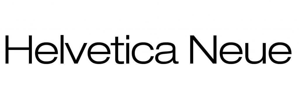
10. Helvetica Neue.
We know Helvetica has become commonplace – but for very good reason. First released back in 1957, Helvetica is a contemporary sans serif that has stood the test of time. Re-released in 1983 as Helvetica Neue, the Helvetica family now contains 51 different font weights and is the quintessential sans serif font.
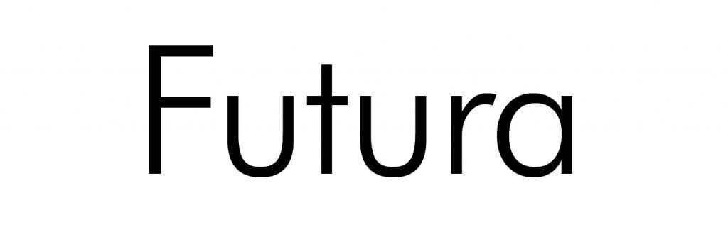
9. Futura
This beautiful font was made in 1927 by Paul Renner, who contrary to popular belief, was nothing to do with the German Bauhaus school. Futura’s clean, rounded and exceptionally versatile form makes it ideal for both large titling and small size footer text alike. Widely coveted to be the next Helvetica in terms of multiple company use, Google, Volkswagon, HP and Crayola have all moved away from Helvetica and are utilising the retro rounded lines of Futura instead as a web friendly, distinctive font for both logos and copy.
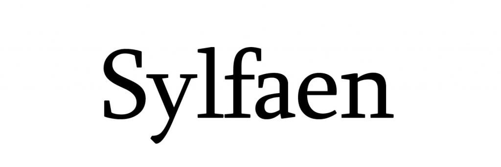
8. Sylfaen
Sylfaen, a multiscript serif font commissioned by Microsoft and designed by John Hudson celebrates its 20th birthday this year. The word Sylfaen means ‘foundation’ in Welsh, it was originally shipped with Windows 2000 and XP. Remarkably, the font included support for English, Latin, IPA, Cyrillic, Greek, Armenian, Georgian and Ethiopian. It picked up The Golden Buki Prize in 1999 for an ‘outstanding contribution to the development of Cyrillic typography and international typographic communications’.
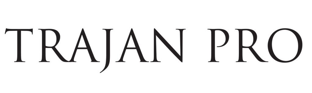
7. Trajan Pro
This beautiful old-style serif font was designed by Carol Twombly for Adobe in 1989. The design is based on Roman square capitals, and takes its inspiration from Trajan’s Column in Rome, Italy. Trajan is an all capitals based font, it remains true to the fact that the Romans did not use lower case lettering. Trajan Pro can be widely found on film posters, TV show titles and book covers across the world and has a timeless, authoritative feeling.
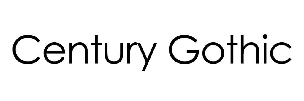
6. Century Gothic
A relative new kid on the block, sans serif geometric font Century Gothic was created in 1991 by the Monotype foundry and was strongly influenced by Futura, though with a much higher x height. It is a digital typeface that has never been made into an actual foundry type. Its origins come from a design intended for large print uses, such as signage and headings. Interestingly, it has been found that Century Gothic is a great font for ink usage; according to the University of Wisconsin-Green Bay, it uses about 30% less ink in print than Arial.
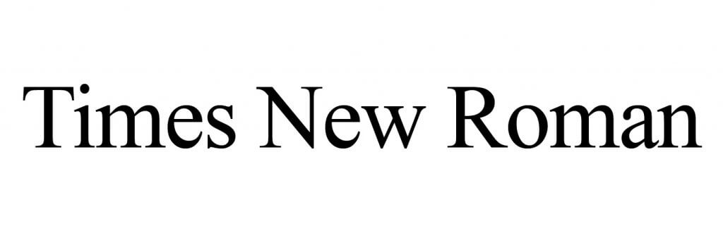
5. Times New Roman
Commissioned by The Times newspaper in 1931 and used for over 40 years, this font is sadly often sneered at as being the default serif font people use on their computers because they don’t know how to change it in the settings! Times New Roman is much more than this however; conceived by Stanley Morison, artistic advisor of the famous Monotype foundry, Times New Roman is still one of the most popular and influential typefaces in book and general printing, and remains a standard typeface on most computers. Once released for commercial sale, it became a runaway success, becoming Monotype’s best-selling typeface of all time in metal type.
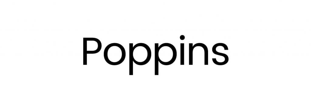
4. Poppins
A new addition to the sans scene, this open source family type was created in 2014 by the Indian Type Foundry. The Poppins family includes five weights, and each font included 1014 glyphs, including all of the unique conjunct forms necessary for typesetting Indian languages, including Hindi, Marathi, Nepali and more. It is the largest Devanagari and Latin family in this style to have been brought to market and we love it.
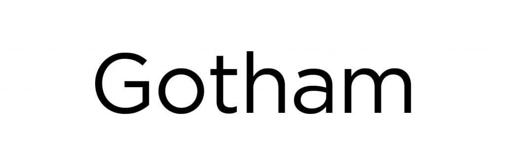
3. Gotham
Slightly more rounded than its distant cousin, Century Gothic, Gotham is a geometric sans-serif digital font created in 2000 by U.S type designer, Tobias Frere-Jones. Gotham has a wide appeal, with its friendly yet solid voice that sits well alongside serif fonts and by itself. Gotham spans over 200 languages and has been widely used across mainstream business and media, including Coca Cola, the TV show Saturday Night Live and has also been used as the Eurovision Song Contest font since 2013. Barack Obama’s presidential electoral campaign even used the font on numerous signs and posters.
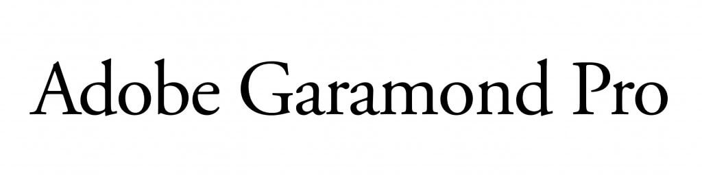
2. Adobe Garamond Pro
This elegant, timeless font is a digital interpretation of the sixteenth century Roman types from French type founder, Claude Garamond. This 1989 variation by Robert Slimbach for Adobe has become a real staple throughout the world of digital, desktop and design. Since the introduction of Open Type font technology, Adobe Garamond Pro can now be taken full advantage of in Open Type applications, such as InDesign.
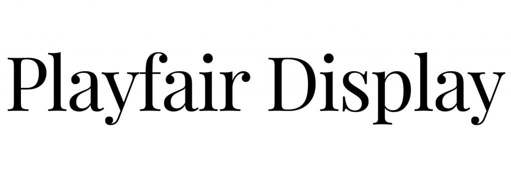
1. Playfair Display
This delightful transitional serif font from Danish graphic designer Claus Eggers Sørensen has only been around since 2011, but has already made a big mark. Primarily for use online, Playfair Display is now available as an Open Type font, with both lining and old-style figures. Inspired by such classics as Baskerville Old Face, this font works beautifully for signage and titling, and brings serif fonts firmly into the 21st century. It goes incredibly well with Roboto, Gotham, Futura and even Helvetica Neue in text pieces. It also works tremendously well against Georgia.
Some further references on this subject;
Miles Tinker ‘Legibility of Print’ ISBN-10:0813824508
Susan Weinschenk, Behavioural Scientist; study in letter recognition vs word shape in lower case text
Simon Garfield; ‘Just My Type’. ISBN 978-1846683022
http://www.britishroadsignproject.co.uk/jock-kinneir-margaret-calvert/