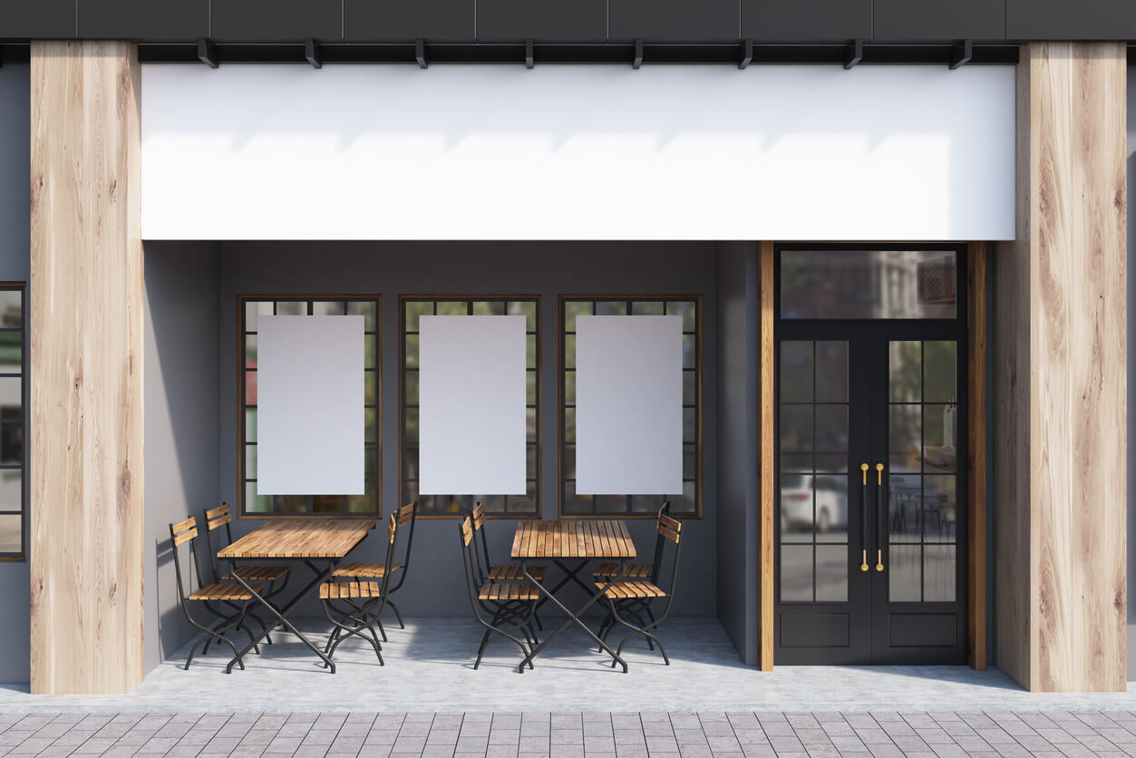
Choosing between indoor and outdoor displays shapes how fast people notice your message and how easily they act on it. In public spaces, commercial signage sets expectations and directs movement. The right choice depends on site conditions and the content you plan to run across a season.
How Indoor Signs Can Guide People
Indoor signs work at close range, supporting wayfinding and promoting offers at the shelf. They also confirm brand cues as people enter. Fonts can use thinner styles than outdoor equivalents because viewing distances are shorter. Materials range from printed boards and acrylic to textile frames.
Good indoor commercial signage gives people quick answers. It confirms they are in the right place, shows where to go next and places the focus on the product or service you want them to pick up.
What Weather Patterns Can Change Outdoor Sign Choices?
Outdoor signage contends with rain, wind and grime so panels need to be produced with materials that stand up to harsh weather. Edges and corners benefit from reinforcement, while larger signs often need a bolder typeface and fewer words so drivers and pedestrians can read safely at a glance.
Great outdoor commercial signage earns attention fast and reads well at both long and short distances.
Which Materials Suit Each Location?
Foam PVC and aluminium composite are often used for indoor projects, while powder-coated panels designed for frequent use are more suited for outdoor projects. Window graphics use printed vinyls and optically clear films.
Material choice links back to the job the sign needs to do. Retail windows favour print quality and neat edges. Street fronts favour strength and clean fixings that allow quick updates.
What Letter Height Works At Distance?
Viewing distance sets letter height and stroke thickness. A helpful rule is that every 25mm of letter height equals roughly 2 metres of clear legibility for simple typefaces. Shorter distances inside shops allow smaller lettering. Larger road‑side or forecourt placements need bigger faces to keep copy legible at speed.
Legibility rules help you size commercial signage correctly for aisles and streets without wasting space or budget.
How to Create Copy For Fast Reading
Sign messages work best when people understand them within a second or two. Start with a short headline that matches the action you want, then add a support line, but only if space allows. Use consistent symbols and icons across windows, fascia and interior points so it feels joined up.
-
Headlines:
aim for five words or fewer where traffic is quick -
Numbers:
use numerals to save space -
Contrast:
pair light text on a dark field or the reverse
Short, well‑aimed copy helps commercial signage land quickly at the distances that apply to your site.
How Should You Light Each Area?
Light helps text and icons stand out in low‑light areas. LED strips within frames and slim lightboxes give a clean appearance, while built‑up letters with a rear halo or face‑lit options give you presence after dark. Power access and local planning rules also affect your options, so ask for specifications early in the process. Commercial signage should work by day as well as night.
Which Fixings Speed Up Installation?
Popular indoor fixings include standoffs and rail systems for freestanding or wall‑mounted units. On external sites, installers often use through‑bolts with penny washers and resin anchors, along with frames that accept replaceable panels. Fixings must match the surface, and cable routes should be planned early where power is required.
Thoughtful choices cut install time and reduce rework across a rollout of commercial signage for multiple locations.
How Should You Plan Maintenance For Busy Sites?
Busy public areas create scuffs and knocks. Plan cleaning cycles and part swaps so signs keep their finish. Outdoors, expect more build‑up from dust and rain. Hinged doors and accessible fixings help teams refresh panels quickly. Hold a small stock of spare parts for areas that suffer from repeated blemishes.
A maintenance plan keeps commercial signage looking fresh and prevents small issues turning into full replacements.
Can You Run a Single Multi-Location Campaign Without Rewriting Artwork?
Campaigns can run one core concept across various locations with minor layout adjustments. Create a master file so designers can resize without rebuilding. Use a clear message hierarchy. Make the headline short. Secondary lines can vary by environment, with tighter edits for roadside or fast footfall and fuller statements for longer dwell areas.
A single visual language across touchpoints helps audiences link shopfronts and interior commercial signage to social posts and ads.
How Should You Use QR Codes on Signage?
Interactive touchpoints suit places where people can pause. Indoors, QR codes near shelves or service points work well. Outside, short URLs with plain page addresses are easy to read at distance. You should always test landing pages for speed and mobile layout.
Used with clear calls to action, these additions help commercial signage turn interest into trackable responses.
How to Pick Sizes For Each Space
Tight aisles benefit from slim profiles and rounded corners for safety. Wide exteriors allow larger signs, but do not assume bigger always reads better. Measure how people will view them from entry points and footpaths, also checking obstructions like bollards and parked cars.
Right sized commercial signage improves sightlines and keeps layouts workable for teams and visitors.
Which Direction Should You Go?
Indoor signs guide people at close range and outdoor signs attract on approach. The right mix depends on your audience and lighting. Start with your most important message and the moment you want people to act. Select a material that suits the environment. Agree fixings that match the site. Then sequence your roll‑out so each location gains a clear uplift.
Want help mapping a plan for commercial signage across shopfronts and interiors? Contact us and our team can guide you through your choices.


